Dear reader,
I have decided that it is charming rather than rude that I drop into your inboxes unannounced like this. But soberly, I hope that you and your families are safe and healthy. If you are touched by fear and grief, I hope you have time and a safe space to process it. If you are angry – as I am – I hope you can channel Granny Weatherwax.
“Granny Weatherwax was often angry. She considered it one of her strong points. Genuine anger was one of the world's greatest creative forces. But you had to learn how to control it. That didn't mean you let it trickle away. It meant you dammed it, carefully, let it develop a working head, let it drown whole valleys of the mind and then, just when the whole structure was about to collapse, opened a tiny pipeline at the base and let the iron-hard stream of wrath power the turbines of revenge.”
- Terry Pratchett
Please give what you can, if you can, to the fundraisers compiled by Mutual Aid India. We have only one another to count on in this time.
This newsletter is called “Show and Tell” because I wanted to talk about how to read images. Visual literacy isn’t something I had, even six years ago. I thought naming your painting “Untitled” was a cop-out, picture books were for children, and that calling a work of art “abstract” was a polite diss. Sometimes, I miss the blithe confidence of ignorance. In those six years though, I met a wonderful art historian who taught me about Indian art, and went to design school where a lot of very patient people explained to me how much thought goes into the creation of an image. I also began creating images myself and understood somewhat the terror and the potential of a blank page.
So, I thought it would be useful to show and tell you what all I think of when creating an image. I begin with a blank page and an urge to create, and every decision I make from that point on is deliberate. But I also know that if I make even slightly different decisions, especially in the earlier stages, I could end up with something almost entirely different. This is the (admittedly, very low stakes) terror: you hope you are making the right decisions, but you don’t know till it’s finished. It is also the potential: you have to control your excitement and impatience as you watch it come alive.
I knew I wanted to paint pomegranates. I associate pomegranates with the Emperor Babur whose love for the foods of his homeland in the Fargana Valley shines through in his memoir Baburnama and heavily influences the food we eat today.
“One type of pomegranate, [is] called big seed, the sweetness of which has something of the taste of an overripe apricot.”
I have painted pomegranates before, and am hooked. Last time, I tried a vertical arrangement with long, purplish shadows, but now I wanted to compose them differently. Besides, have you seen a pomegranate? It almost seems like sacrilege to eat them. No, I want to string pomegranate arils up and wear them around my neck and in my ears. Queens should have crowns made of them. I want to build voluptuous sculptures from the arils and sew the skins into purses. Since I can’t do any of that, I want to paint them, so as to preserve their beauty before they turn into food.
I began with trying to photograph my own pomegranate, but the light wasn’t right. So I went on trusty old Google and came up with a few reference images. They let me decide my composition.
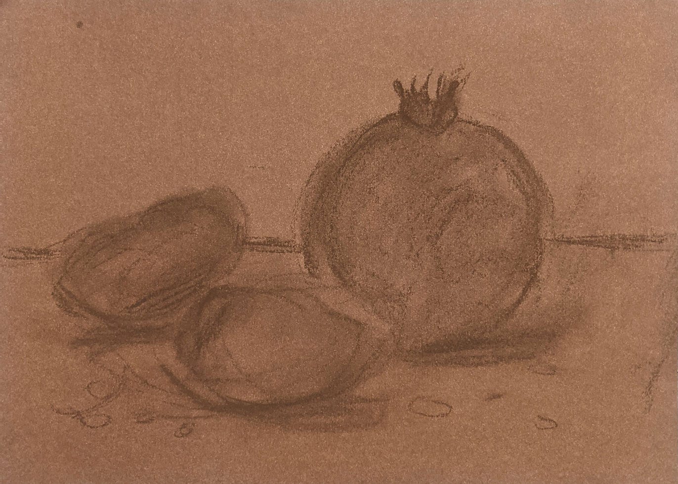
This is the part I like to get done the quickest. The blank page is scary, so it makes sense to fill it up as fast as I can. I simply think of where things will go. Lately, I’ve been obsessed with Julian Merrow-Smith’s paintings, so I knew I wanted to draw a close-up on a table. I put the large whole pomegranate a little off centre, and positioned the two sections on the other side, in front of it. They are smaller in size, but will be brighter, providing visual balance. I also drew some tentative shadows placing the light source on the top left. I drew a few loose arils to complete the balance. These can be moved around later. I picked brown for this sketch just so it would be unobtrusive later.
This whole painting is to be in soft pastels, which are a mix of crayon and chalk. Their chalkiness means they blend beautifully, and I don’t have to fuss with a palette or paintbrushes.
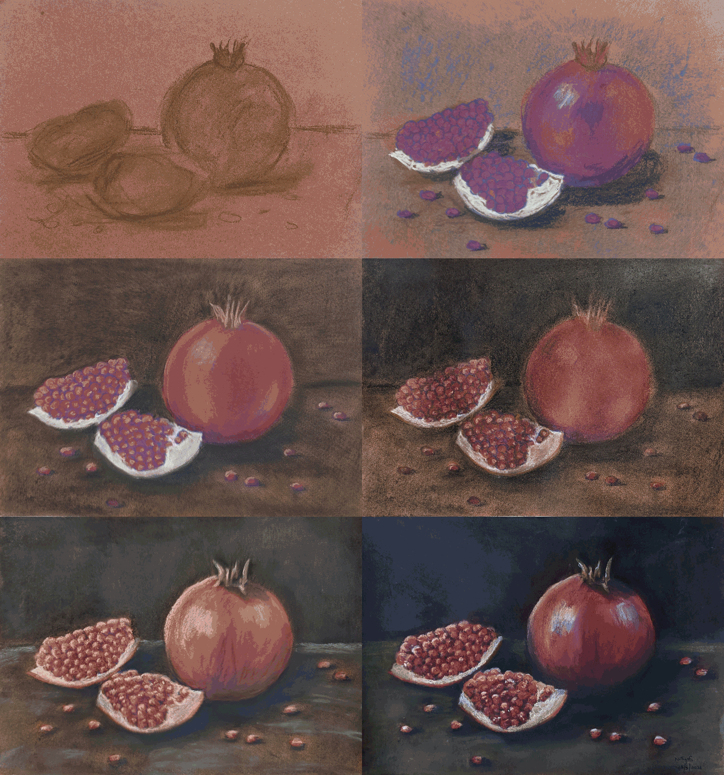
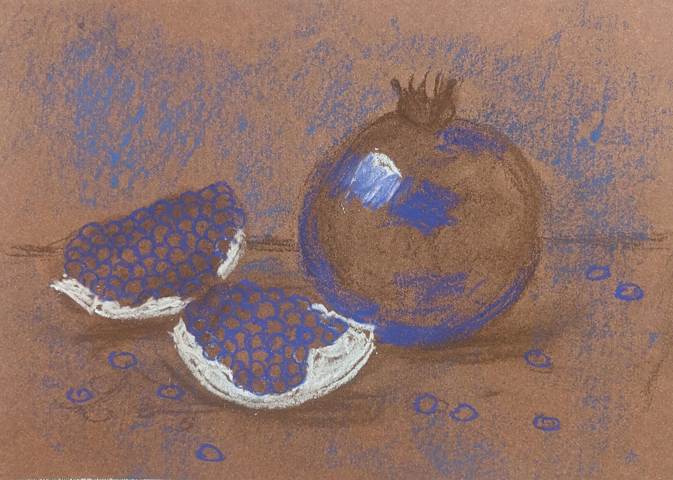
Next, I added a violet-blue undercoat wherever I knew there would be shadows. I used to use black for this, but that was a rookie mistake. It’s better to build up to black. The dark has layers to it. Very few things are truly black. I often think of Douglas Adams’ definition of Absolute Black: “So black … light just seems to fall into it”. I don’t want the light to fall into my painting. I want to control its flow.
I also added white for the pith of the pomegranate.
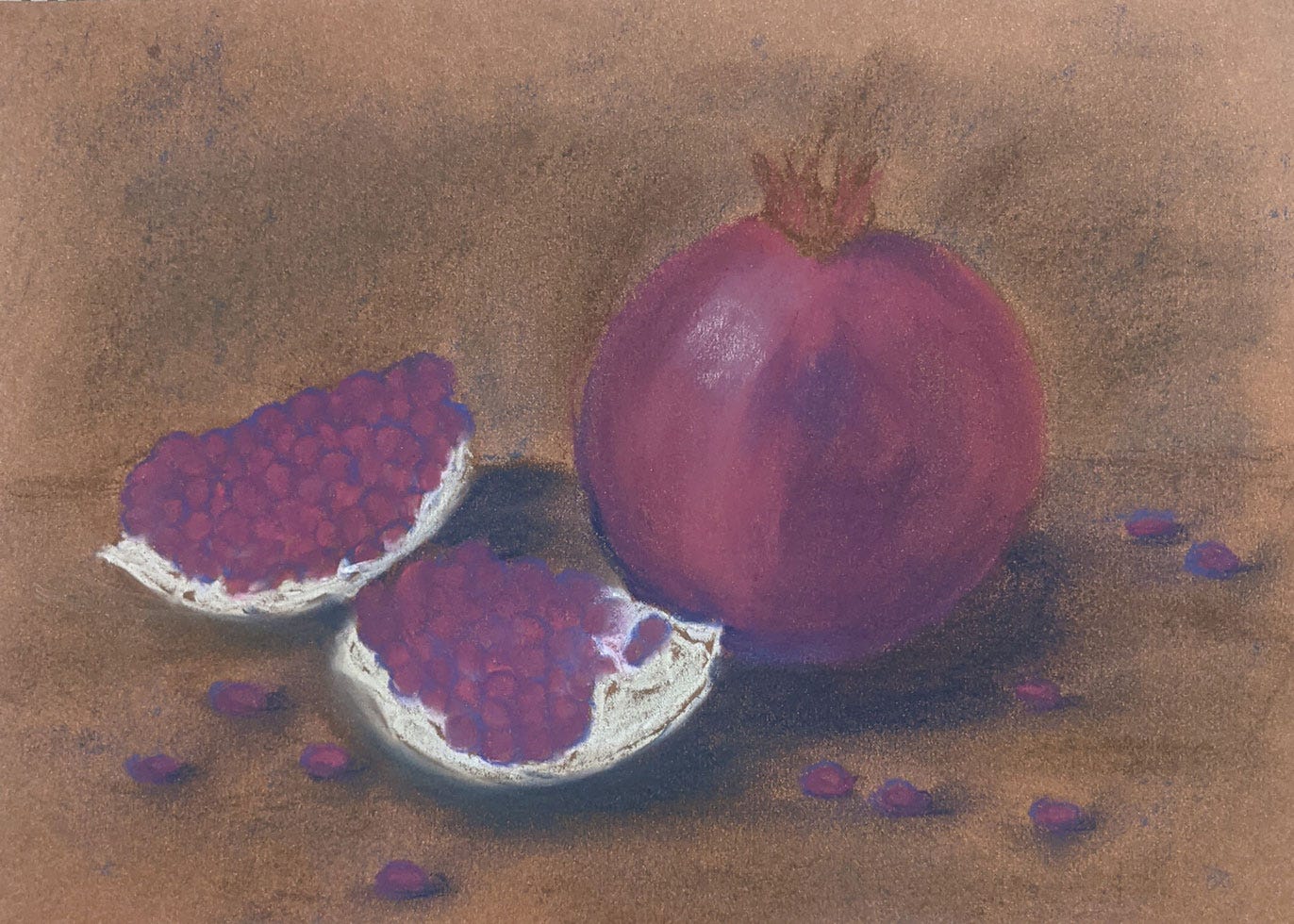
Note that I haven’t touched my red pastel yet. This is still a magenta that I used to fill in the space between the shadows. All of these colours are cold and make my painting look chilly. If I had gone for browns and oranges, I would have a warmer painting from the beginning. But I very much like to start off cold and then add touches of warmth with a great deal of deliberation, only where they are deserved.
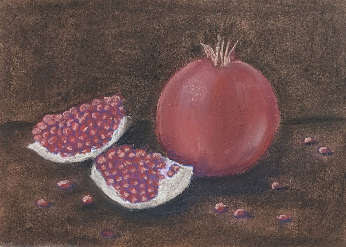
In the previous slide, I added in some navy blue to deepen the shadows, and here I smudged it all together. I find my fingertips work very well for smudging; I just have to be careful not to touch my face after. My background has browns and blues right now. I want it eventually to be dark, but a sort of bruised dark. You’ll see.
Here I lengthened the shadows with the first touches of black, pulling it out with my fingers. I also darkened the background. In the real world, you add light by flicking on a switch. In a painting, you do the reverse: you add dark every place you don’t want the light to be. It took me a long time to realise this, and it is something I struggle with quite a bit. But once I began making light by deepening the shadows, my work began to come alive.
6
I used a cream coloured pastel to add in some light, so I would know its direction. Pomegranate arils have a series of planes in their shape, because of how they grow. The light reflects off these. That is why I add flat strokes for the light. I also add a hint of cream to the arils below to suggest the seeds inside.
If you look at my painting’s progress you will see that the light keeps shifting right till the end. I was trying to capture the translucence of the pomegranate aril and this is hard to achieve.
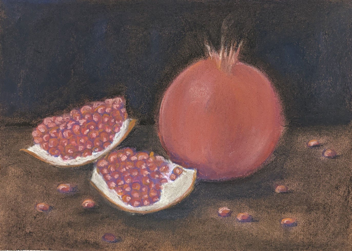
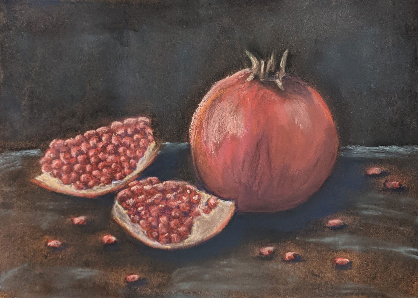
Here is my first real touch of warmth: I added orange highlights. I was careful about these, only adding them where I wanted a little glow. I also began smudging in the cream and orange and shadow. The painting is starting to come alive.
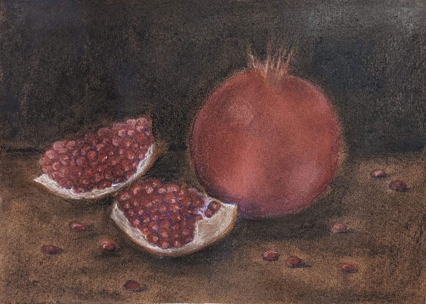
At this stage I sprayed it with a fixative spray, which made it look considerably worse. But this was also deliberate: it adds texture. Beyond a point, if I had gone on without spraying, the paper would have stopped holding colour. The spray sets the powdery colour in clumps, giving me something to scrape future pastels off of. It also adds the most glorious texture. You’ll see.
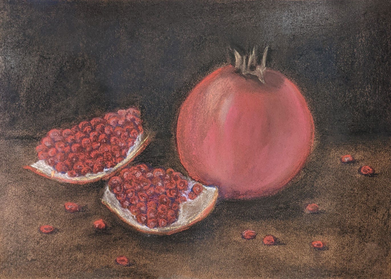
Here I finally used red. It was so pretty, I was tempted to stop for fear that my painting would never look better. Look how it glows against the purple shadows? It is these moments that I live for.
At around this stage, I think of Eavan Boland’s words: “What you are watching / is light unlearning itself / an infinite unfrocking of the prism.”
I tend to get a bit grand when I’m painting.
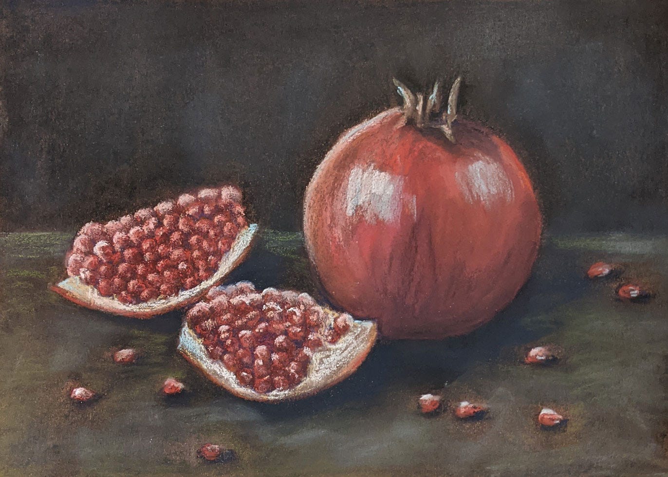
I’ve added more light now, in cream and pastel blue. It gets blended into the dark of the backdrop, but also forms pools of light on the table on which the pomegranates are resting.
A touch of blue goes on to the white pith of the pomegranates, adding shadow and coldness. I also added more shadow to the top of the whole pomegranate and blended it in.
I add some green to the table, both to differentiate it from the background and because reds and greens are complementary. Each makes the other stand out more.
By this point, I’m being very careful. I think very hard before adding a stroke, and pause often to stand back and look at my painting. I reinforce the lighter parts with a little white. See the texture it now has?
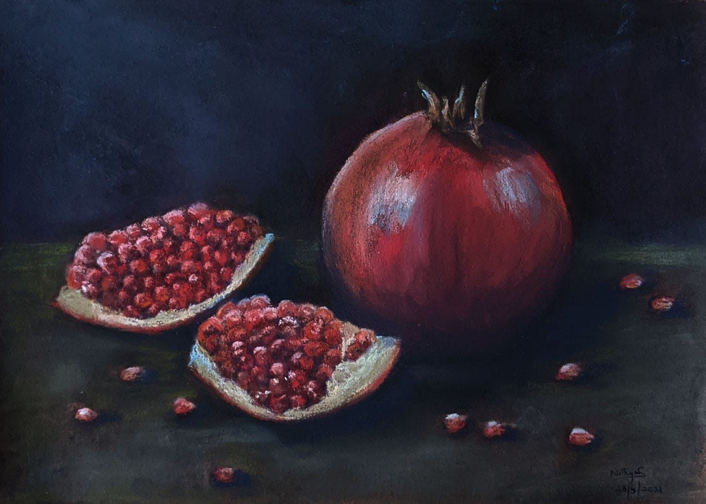
I add more light.
Then I take some of it away.
I don’t always know when to stop with a painting, but with this one, it was easy. I walked away, made a cup of coffee, and came back and was still pleased with it, so I stopped.
Some pieces I enjoyed that I thought you might too:
It seems to me one looks at paintings hoping to find some secret. A secret not about art, but about life. And if one finds one, it remains a secret, because, finally, it is untranslatable into words.
John Berger on Still Life painting.
When he was asked what he thought his epitaph should be, Philip replied, 'I’m not really concerned. I’ll be dead then'.
Peter Hunt on the funeral service of Prince Philip.
I was expecting the coverage to be a lot of things I haven’t personally got much time for: royalist (obviously), obsequious (naturally), nationalistic (inevitably). But I’ll admit I was not expecting it to be quite so… patriarchal.
Debbie Cameron on the patriarchy in the media coverage of Prince Philip’s death.
It’s an individual decision to pick up a gun and go on a murder spree. But the question of why, especially when we see patterns of who picks up guns, and who they kill — that’s social.
Everything in Jill Filipovic’s newsletter, but especially this, on the poverty of language when we speak of racism and misogyny.
Halston the series is fabulous, glittering, fashion-filled, celebrity-packed and gorgeous to look at, but as an examination of the man’s life, it’s about as surface-level as can be, which is odd when you consider how much the series is focused on his every action and decision.
Tom and Lorenzo’s review of Halston. I’ve watched two episodes and find myself agreeing with them.
If you liked this post, share it with someone you think will appreciate it too? Leave me a comment telling me what you thought, or if there’s something I left unanswered? I’d love to hear from you.
Stay safe, folks!





Beautiful pomegranate! Happy to be with you in the Gumbo Group for the next few weeks!
charmingly presented. I want more like these, please. Every word is meaning filled.